
Overall concept: I have chosen to keep the layout very simple , to make it easy to view and locate content, whilst also allowing the images shown in galleries and slideshows to stand out. I am using the existing University of Canberra (UC) header and footer throughout the Faculty of Arts & Design (FAD) and therefore the Graphic Design (GD) pages. Maintaining the UC header throughout these pages provides consistency, allows users the luxury of not having to re-think where this information is found, and also means the UC information can always be accessed.
Beneath the UC header, will be the FAD header and the FAD navigation bar, which will also be displayed throughout FAD pages. All Graphic Design pages will display the GD sidebar for navigation of GD content. Like the use of the UC header, the FAD header and navigation bar, and the GD sidebar navigation will be displayed consistently for consistency and ease of use.
The orange and blue headings and accents allow consistency from the UC Home Page, and contrast against the dark background. I have used a photo for the background and blended the edges back to black, so they will blend against the black background, that will appear when the page is displayed on screens with a resolution that has a pixel width larger than 960.
The orange of the FAD heading and the navigation bar, indicate the relationship between the two, that being the related FAD content. The space between the FAD navigation bar and the UC footer is then available for content, which will include the sidebar for the course pages. The content will be separated with curved corner boxes, to provide clarity and efficiency for the user as they can simply glance at these areas and move on after quickly seeing what that area includes. I have detailed my research and preparation for the build phase below.
Site width and position: The width of the site is 960 pixels, in line with the assignment criteria, the 960 grid and majority of screen resolutions. All the sites I looked at from the BestWebGallery were set up with the same width of 960 pixels. In addition the websites are centred, and most have a background which blends with the 960 layout, should the screen resolution exceed a width of 960 pixels. Further examples of this practice include Awesome and Row To The Pole.
Header style and size: I have chosen to use a heirachial approach, by firstly using the existing UC header, and then to use another header for the Faculty of Arts and Design (FAD). I like the idea of maintaining both headers throughout the FAD pages, to ensure consistency for the user in locating content and to reduce a duplication of information being presented differently from the UC home page. Maintaining the UC header throughout all UC pages, ensures users become familiar with finding UC related information, and can access it from every UC page. In addition, maintaining the FAD header throughout the FAD pages provides the same accessability and familiarity throughout the FAD pages. One of many examples where the header is maintained throughout all sites pages is carbonmade.
By including the existing UC header and footer in my page, I wanted to ensure the rest of the pages worked well with these existing elements, in terms of functionality and aesthetics. I’ve used a black and white background image, grey, orange and blue text to go with the colours in the existing colour scheme, and grey, white, orange and blue colouring for the remaining elements such as the content boxes, navigation bars, lines and arrows. I wanted the look and feel to be quite simple, to make it easier to locate content and to allow colours and images to stand out. The curved edges of the content boxes seperate content, and are less harsh than sharp corners, and gives a more more friendly and approachable look. An example of relating the content in the centre of the page, to the header is displayed in the Amaze Lab website, where the circles, rounded corners, colours, background and fonts are repeated.
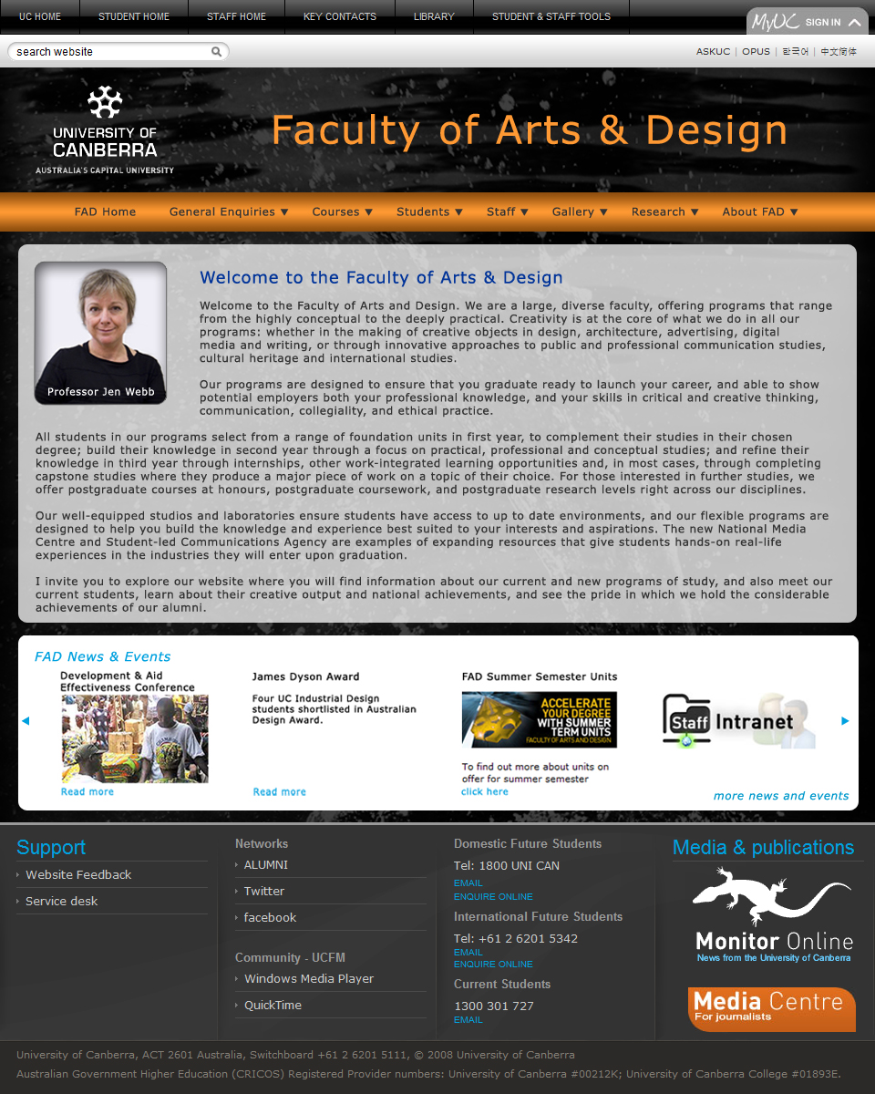
The FAD header is 137 pixels high and the orange FAD navigation bar is 43 pixels high – so a total of 180 pixels high combined. The slideshow or spotlight area is 192 pixels high, so they balance quite well. This space also allows sufficient room for the large FAD heading, allowing users to clearly identify where they are. The orange of the FAD heading and the FAD navigation bar indicate a relationship, ie. that the links from the FAD navigation bar are FAD related. An example of where the height of content areas balance with the header is in the Typefaces website, where the header sits above a content area which is greater in size, and another row of content which is roughly the size of the head sits beneath that.
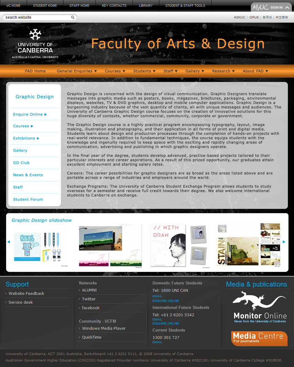
Number of columns and width/size: I have used two columns in the content section below the FAD header and navigation bar. The first column is solely used for the Graphic Design (GD) navigation (ie. sub or local navigation). The GD sidebar navigation is to be maintained throughout GD pages, again for consistency and accessability. The width of this first column is 172 pixels wide, which is close to the 180 pixel height of the FAD header and navigation – providing balance. The second column is to be used for content, with the display of content to be driven by the GD sidebar navigation. This area is 722 pixels wide, approximately four times larger than the GD sidebar, allowing adequate room for content to be displayed. The carbonmade website has a simular layout, with the navigation on the left side and a larger space for content to it’s right.
Background style and position: The background uses a black and white image (splash, by S Mackell), and although quite subtle beneath the content, it provides some interest and grounds the page. More of the image will be visible when the dropdown menus are revealed, by clicking on one of the links with an arrow from the orange FAD navigation bar. The content box beneath the FAD navigation bar is partially transparent, so you can see a hint of the continuing image beneath it, without it being too distracting. The splashing water image was chosen as an example of photography, because the droplets look a little painterly and for it’s relationship to ‘making a splash’ in the industry of arts and design. The following sites provide examples of where background imagery or graphics have been used – Make Photoshop Faster, Bullet PR, Agami Creative and Blue Moon Duelling Piano Bar and Restaurant.
Main navigation style, size and position: The navigation is divided, so UC content, FAD content and GD content have their own navigation bars. The main navigation for the FAD pages is the orange FAD navigation bar, which sits beneath and/or is a part of the FAD header. The FAD navigation bar takes priority as it’s gives the user and understanding of where they are, when they are within the GD pages. This navigation bar is the same colour as the FAD heading, to provide a relationship and indicate that the links in the orange FAD navigation bar relates to FAD content. The bright orange ties in with colours in the existing UC footer, and is a contrast against the dark background. As the navigation is a horizontal line, it gives a line for FAD content to ‘hang’ from, and it also reflects the style of the UC header and footer. The navigation bar sits beneath the FAD header, so that it’s given importance, but the size of 43 pixels is modest so it’s not too overpowering. I would also like the look of the link clicked on from the navigation bar to change when that dropdown is displayed. Some examples of sites that use a simular approach to main navgation are Museum of Australian Democracy and tictoc. I would like to use dropdowns like those used in the Waterworks site.
Sub navigation style, size and position: The sub navigation, being the GD sidebar, is located on the left side beneath the main navigation bar. The style of the sub navigation is more subdued, but is clearly visible with the use of blue text, lines and arrows on a white background. The GD navigation sidebar is to be displayed throughout GD pages, so that it’s accessable within the GD area. The links which have an arrow beside them indicate a dropout menu will appear, providing additional links under each heading. Like the main navigation, I think it’s a good idea to have the link on the sidebar to look different, when that area is being displayed. An example of sub navigation being maintained on all pages of a section within the site is the ‘Examples’ pages of carbonmade.
Search field style, size and position: I have chosen to use the existing search functionality, as it’s a part of the existing UC header, and this allows the user to become familiar with locating the search field. I think it is better to have a single search field, with the search results page that filters the search results. As this isn’t part of the scope of this assignment, I haven’t looked into filtering options, however I have looked at a number of sites when considering the use of the existing UC header, and therefore a single search field for the entire site. The familylife site is one of many examples that uses a single, consistent search field throughout the sites pages.
Body text size, style and colour: I’ve chosen ‘Verdana’ as the body text as it’s a clean sans serif type which is easier to read on screen, and is widely available so it shouldn’t change when viewed on different computers. I have used a dark grey (R:51 G:51 B:51) as this is a standard web based colour, and is a little less stark than using black, whilst still providing a good contrast against the pale grey background. The size of the type is 12, which I have found to be quite a common size throughout other sites – it allows for large amounts of text to be displayed, without being too small to read. The colour of the body text varies in other areas, to suit the background and provide variety, but remain consistent with other areas of the page and also remain websafe colours. The colour of the type in GD sidebar is blue (R:0 G: 153 B:204), and in the dropdown menu from the FAD navigation bar, it will be either orange or pale grey to contrast with the dark background. The body text in the Tapbots is simular in style and size, and also uses a contrasting colour against the background.
Body headings size, style and colour: The headings for the site are also ‘Verdana’ but are size 15 and are blue (R:0 G:153 B:204) so they stand out from the body text and provide clarity and information at a glance. The colour variation also provides interest, but remains consistent with the rest of the page. A slight variation to these headings, is for the slide show beneath the main content area, where the is slightly smaller at 14, and is in italics to make it lighter. The Africa Tour section of the Stop Child Labour site also uses a different colour and size for the headings and sub-headings.
Body links size, style and colour: The text used for the links will be the same size and typeface as the body text, but the colour will be the blue used for the headings (R:0 G:153 B:204), so it is consistent with the colours of the site and will also indicate the text contains a link. I was suprised to find that all the sites I looked at from BestWebGallery didn’t have links that changed colour once they’d been visited. At this stage I’d like to keep the links the same colour, however I may change my mind on this during the build phase. Some of the many sites which use a different colour or style for the links, and which maintain that style and/or colour once the link has been visted include carbonica and cappuccino.
Body image/s size, style and colour: There will be a number of images used within the FAD and GD pages, including the background image already discussed. Additional images and grpahics will include the UC logo, a modified image of FAD Dean (Professor Jen Webb), modified images from the FAD news area and GD slideshow, static images of the existing UC header and footer, curved content boxes, lines and arrows.
Conclusion: I am pleased with the results of this research and planning phase, and think it will be very useful during the build stage, as all the elements will already have been carefully considered. Although this planning stage has been helpful, I think I would find it difficult to have this set in stone, as the build phase may highlight areas which are too challenging for my current level of coding knowledge, or I may change my mind about what works or looks good. In any case, I am pleased to have discovered the importance and the benefits of dedicating time to planning, researching and preparing, before simply launching into the build phase without much idea of what you’re going to do.
-")


 SMackdown!